caulfield12 Posted June 13 Share Posted June 13 (edited) Debut: June 5, 2021 Verdict: Staying within the Sox’s iconic black-and-white color scheme but adding a new twist to the look works great, as does putting Southside across the chest. The only problem is that now I have Tony LaRussa falling asleep in the dugout in these uniforms forever embedded into my brain. Grade: A https://sports.yahoo.com/ranking-all-mlb-city-connect-jerseys-from-the-dodgers-at-no-28-to-the-marlins-at-no-1-230450990.html Marlins #1 and Padres #3 with most vibrant color combos. Edited June 13 by caulfield12 Quote Link to comment Share on other sites More sharing options...
Snopek Posted June 13 Share Posted June 13 I really like the Sox, Padres, Nationals and Rays. There are a few other ok ones, but most of the rest just feel really half-assed or safe, which kind of defeats the whole purpose for me. Quote Link to comment Share on other sites More sharing options...
Milkman delivers Posted June 13 Share Posted June 13 Ugly. Every one. 1 Quote Link to comment Share on other sites More sharing options...
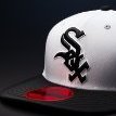
Quin Posted June 13 Share Posted June 13 I think with the best ones is that they (at least the Sox and Marlins) submitted designs to Nike instead of vice versa. If I could change one thing about the Sox, I'd swap the Chi hat for this hat that a local artist made and they did a giveaway for. It's one of my favorite hats that I've got. Thoughts on others, in order of the rankings of this article. Baltimore should have had the color on the outside instead of the inside for some weird reason. Why in the world did the Cardinals make their pinstripes so hard to see??? Philly is fine design wise, but the color scheme - while I get it - is too far of a departure. Long live the Peagle. Love Texas' jersey. Mets needed more purple to contrast with the gray if they're going with the subway lines. Boston has grown on me. Angels should adopt these as their primaries. CINCY looks like a sublimated softball jersey. Royals went simple and it paid off. Brewers is only ruined by MKE, much like the Sox "Chi" If there was more red in the Serpientes jersey, it'd be top, top tier. Skateboarding Ray and the texture = win Cleveland's is boring, no idea why it's ranked high. I can't decide if I love or hate Colorado's green. Padre's are grand. Washington should keep these but stop doing three letter abbreviations for the love of god. Marlins are fucking fire and are a great way to pay homage to city culture and the past. Yankees are a joke for not participating (and they lost jersey purity arguments the second they slapped a giant concrete logo on their sleeves). A's are a joke in general. 1 Quote Link to comment Share on other sites More sharing options...
southsider2k5 Posted June 13 Share Posted June 13 The Sox jerseys are so far over and above every other look, I can't even take serious someone who places them 5th. Quote Link to comment Share on other sites More sharing options...
Texsox Posted June 13 Share Posted June 13 3 hours ago, Milkman delivers said: Ugly. Every one. X2 I'm just not a fan of uniforms for profit. Quote Link to comment Share on other sites More sharing options...
T R U Posted June 13 Share Posted June 13 3 hours ago, Quin said: I think with the best ones is that they (at least the Sox and Marlins) submitted designs to Nike instead of vice versa. If I could change one thing about the Sox, I'd swap the Chi hat for this hat that a local artist made and they did a giveaway for. It's one of my favorite hats that I've got. Thoughts on others, in order of the rankings of this article. Baltimore should have had the color on the outside instead of the inside for some weird reason. Why in the world did the Cardinals make their pinstripes so hard to see??? Philly is fine design wise, but the color scheme - while I get it - is too far of a departure. Long live the Peagle. Love Texas' jersey. Mets needed more purple to contrast with the gray if they're going with the subway lines. Boston has grown on me. Angels should adopt these as their primaries. CINCY looks like a sublimated softball jersey. Royals went simple and it paid off. Brewers is only ruined by MKE, much like the Sox "Chi" If there was more red in the Serpientes jersey, it'd be top, top tier. Skateboarding Ray and the texture = win Cleveland's is boring, no idea why it's ranked high. I can't decide if I love or hate Colorado's green. Padre's are grand. Washington should keep these but stop doing three letter abbreviations for the love of god. Marlins are fucking fire and are a great way to pay homage to city culture and the past. Yankees are a joke for not participating (and they lost jersey purity arguments the second they slapped a giant concrete logo on their sleeves). A's are a joke in general. Minnesotas look real nice, apparently they debut tomorrow. Quote Link to comment Share on other sites More sharing options...
joejoesox Posted June 13 Share Posted June 13 no way " smithside" is better than Los Serpientes Quote Link to comment Share on other sites More sharing options...
Quin Posted June 13 Share Posted June 13 27 minutes ago, joejoesox said: no way " smithside" is better than Los Serpientes The Sox jersey has tiny flaws (spacing between letters, my aforementioned hat critique) and it's still upper echelon. I'd like to see it with gray pants as well. And like I said, add more red - or even teal - to Serpientes and it becomes something the Dbacks should keep in rotation. Quote Link to comment Share on other sites More sharing options...
The Mighty Mite Posted June 13 Share Posted June 13 4 hours ago, Milkman delivers said: Ugly. Every one. Especially the Rays. Quote Link to comment Share on other sites More sharing options...
Recommended Posts
Join the conversation
You can post now and register later. If you have an account, sign in now to post with your account.